CSS Box-Sizing for Noobies
Box-sizing basically is an alternative to the standard box model we have in CSS. To fully understand box-sizing you need to understand the box model. Practically, they work just about the same but there is one key difference – one that will be discussed in depth later. So, let’s get started by examining the good old box model.
Box Model
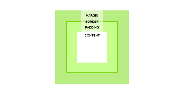
Since HTML elements are essentially boxes and CSS uses those boxes to go about the design and layout, we have the box model. With a typical HTML element, you have its width and height which makes up the content area, and then this area is wrapped with padding, border and margins. To best understand it, take a look at the image below.

The content area is wrapped in padding, border and a margin like I’ve just said. Take note of the relationship between these properties, first you have the content area that is defined by width and height whether it is automatic or specific, it is always there. Then there is the padding, followed by the border and lastly the margin. Here is a more precise definition for all of the different parts.
- Content – is where the text or images are.
- Padding – clear area around the content that is affected by the background of the content’s box.
- Border – an outline around both the content and the padding which can have its own background, thickness and texture/pattern.
- Margin – clear area around all of the previous parts that is always transparent and never affected by the background of any of the previous parts.
When setting a width and height of the element, you are only defining the height and width of the content area. In order to calculate the total width and height of this element, you need to also include the padding, border and margin sizes.
Here is an example:
	.box {
		width: 100px;
		padding: 10px;
		border: 5px solid black;
		margin: 10px;
	}
The width of the content area is indeed 100px. However, the element as a whole will have a width of 150px because you also need to include the remaining parts widths. Doing the math here is a bit tricky at first because you need to count the padding, border and margin twice as it appears on both sides of the content box.
In its simplest of forms, the calculation is something like this: width + padding + border + margin = total element width. Here are the numbers from the above example: 100px (content width) + 10px (left padding) + 10px (right padding) + 5px (left border) + 5px (right border) + 10px (left margin) + 10px (right margin) = 150px (total width).
How does box-sizing differ?
Box-sizing follows the box model in that you have the content area first, then padding, followed by border BUT NOT INCLUDING MARGINS. That’s right – box-sizing doesn’t account for margins.
However, when you set a width or the height for the element, that is now the total width or height for that element as a whole. So instead of having to add padding and border onto the set width, you are subtracting it in order to obtain the actual content area. Let’s look at the formulas: width = total element width and width – padding – border = content area width.
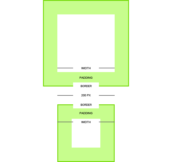
Again, here is the math from the above example: 100px (total width) – 10px (left padding) – 10px (right padding) – 5px (left border) – 5px (right border) = 60px (content width). Basically, the idea is reversed and to better comprehend it, check out the image below which will demonstrate the two models side by side.

How to use box-sizing
In order for box-sizing to work, you need to use a few lines of code within your CSS to ‘activate it’. You can apply this code to a particular element that you would like box-sizing to take effect on or declare it for elements with the asterisks cheat. Of course you have to be mindful of browser support which is why you should always use browser specific prefixes which will be discussed shortly.
	.box {
		box-sizing: border-box; /* Opera/IE 8+ */
		/* box-sizing is only applied to this particular class */
	 }

	 * {
		box-sizing: border-box;
		/* box-sizing is only applied to all elements */
	 }
Syntax
{box-sizing: content-box|border-box|inherit;}
The above is the basic syntax of box-sizing, there is nothing else to it. However, let’s go over all of the three values that it can take.
- Content-box – this is the default setting that specifies for the defined width and height properties to be the width and height of the content area only and that the padding, border and margins are to be laid out outside of the specified width and height.
- Border-box – The specified width and height properties are the width and height for that element as a whole therefore any padding or borders are laid out within the specified width and height for the particular element, subtracting from the width and height.
- Inherit – as with any other inherited value, it defines that the box-sizing value be taken from the parent element.
So, why should I use it?
Yes, I understand that this is a bit backwards especially if you have been using and are used to the regular box model. However, if you don’t understand or don’t like the box model, box-sizing is your friend.
Yet, there is one other big advantage which is that box-sizing is an ideal way to create fluid layouts. Because the box-model handles the math for you, it is much easier to create and manipulate fluid elements and therefore the overall fluid layout.
Let’s take a simple scenario where, for instance, you have a simple layout with two div elements where they should both be 50%. That’s all great but then you have to subtract padding – which is 10%, by the way – to separate the two. So you do the math and change the numbers accordingly. With box-sizing you don’t have to do that! You set your width and set your padding and done!
Now here is my selling point, if you will, not all layouts will ever be this easy and simple. You have so many things going on with hierarchies, and uneven elements among a headache of other things. Box-sizing saves you time by helping you code more efficiently.
